Project overview
Rachel Macias is a jewelry designer and metalsmith whose work explores light, mass, and the quiet geometry of sacred spaces. Until this project, most of her work lived in exhibitions, studio photos, and social media posts. I wanted to create a dedicated portfolio site that treats her pieces with the same care as a gallery space: calm, intentional, and clearly curated.
This was a self-initiated project: there was no agency brief, just a desire to design an artist site that feels like it could sit comfortably between a museum homepage and a contemporary gallery. I documented the process in a short thread—starting with messy iPad sketches, moving into Figma with MS Paint placeholder art, and finally building out the front end once the structure felt right.
Design goals
Before touching Figma, I wrote down a set of goals to keep the site focused and avoid the “everything and the kitchen sink” trap that artist portfolios can fall into.
- Give the work a museum-like frame. The site should feel like a quiet, thoughtfully lit gallery—large images, generous margins, and typography that supports the work instead of competing with it.
- Keep the structure simple and legible. Visitors should immediately understand where to find the portfolio, the artist statement, and contact information. No experimental navigation, just a refined, conventional layout.
- Highlight both the artist and the pieces. The homepage needed to balance biography with individual works: a hero that introduces Rachel, plus sections that feature specific pieces with context.
- Design mobile-first, then scale up. Many people will encounter her work on their phones, so the design had to feel just as considered on a small screen as on a desktop.
- Leave room for growth. The site structure needed to support future collections, exhibitions, and press without requiring a redesign every time something new is added.
Process
1. Gallery & museum inspiration
I started by collecting references from museum and gallery websites. I paid attention to how they handled hero images, exhibition copy, and the transition between full-bleed artwork and neutral content blocks. Certain patterns kept showing up: centered hero typography over artwork, subtle navigation, and careful use of negative space around images and text.
2. Rough iPad sketches
Before opening Figma, I sketched out the homepage on my iPad. The sketches were intentionally loose: a hero band, an “About the artist” section paired with a portrait, featured work blocks, and a simple footer. I marked interactions like a scroll cue on the hero and potential slide-in transitions for the about sections.
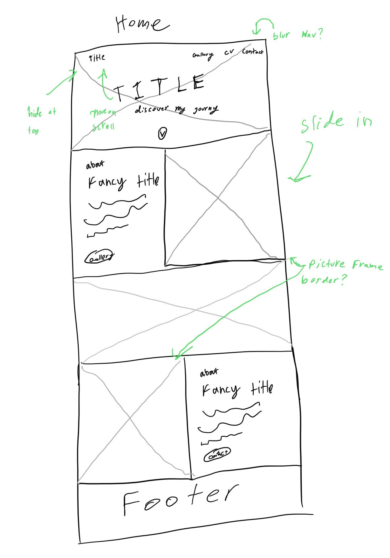
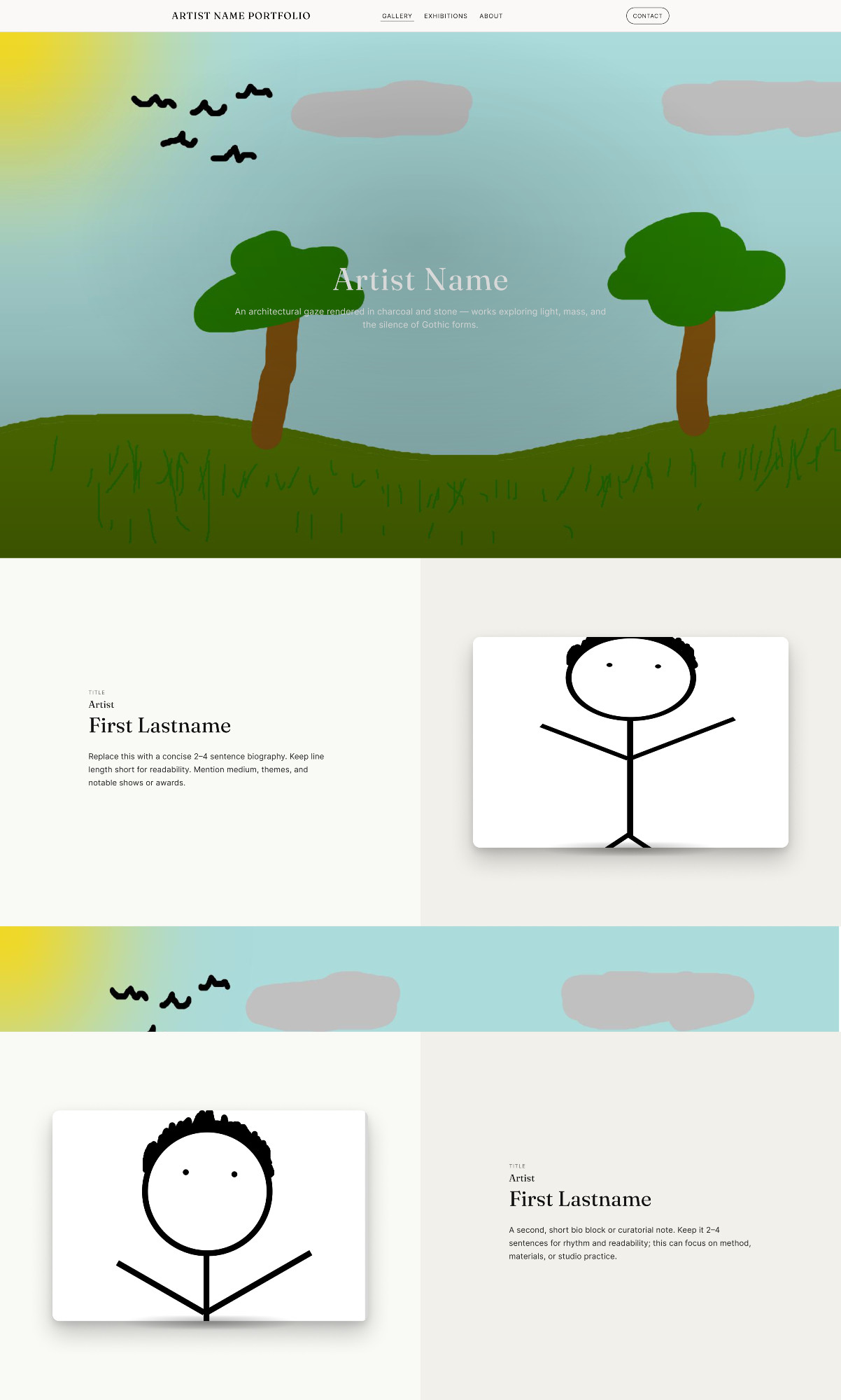
3. Figma layout with placeholder art
I pulled the sketches into Figma and began blocking out the layout using placeholder art (including some intentionally goofy MS Paint landscapes and stick figures). This made it easy to focus on the rhythm of the layout, card proportions, and typography without getting precious about the visuals too early.
Once the structure felt right, I swapped in Rachel’s actual work and portraits, adjusting spacing and type scale to suit the photography and metal textures.
4. Front-end implementation
With the Figma prototype stable, I built the site using semantic HTML, custom CSS, and light JavaScript for navigation and scroll cues. I mirrored the visual hierarchy from Figma and paid particular attention to:
- Consistent vertical rhythm between sections.
- High-quality image rendering with subtle shadows and frames.
- Responsive breakpoints that preserve the “gallery wall” feel on smaller screens.
Key design decisions
1. Hero as a single, strong statement
The hero section uses a full-bleed background image of Rachel’s work with her name and a short line of copy centered over it. The navigation is minimal and tucked into the top edge, echoing how museum sites foreground the exhibition title over everything else.
2. Alternating “about” and “piece” blocks
Scrolling down the page, visitors move through alternating bands: an about section with text on the left and a portrait on the right, followed by a feature block with a large piece on the left and a curatorial-style note on the right. This left-right rhythm keeps the page dynamic while still feeling calm.
3. Warm neutrals and subtle color bands
The background uses warm off-white tones and horizontal bands of artwork as separators, similar to banners in exhibition catalogs. This approach lets metal and stone textures stand out without the page feeling cold.
4. Typography that reads like a catalog
Type is set in a simple hierarchy that borrows from print catalog design: small-caps labels, serif headings for the artist name and piece titles, and a clean sans-serif for body copy. The result feels more like reading a wall label or essay than browsing a typical portfolio template.
What I learned
This project taught me how to translate someone’s artistic voice into a digital space without overwhelming their work. Starting with hand sketches and MS Paint placeholders gave me permission to iterate quickly before making anything pretty, and pulling inspiration from museum sites helped me think in terms of pacing and curation, not just individual screens.
It also reinforced how much a simple, well-considered layout can do for an artist: by giving Rachel’s pieces a quiet, structured home online, the site makes it easier for curators, potential clients, and friends to see her work the way it’s meant to be seen.
Interested in this project or in similar artist sites?